

Read about Dual Pixel's balanced approach to Visual AI in design. Embrace creativity while using AI as a helpful tool.
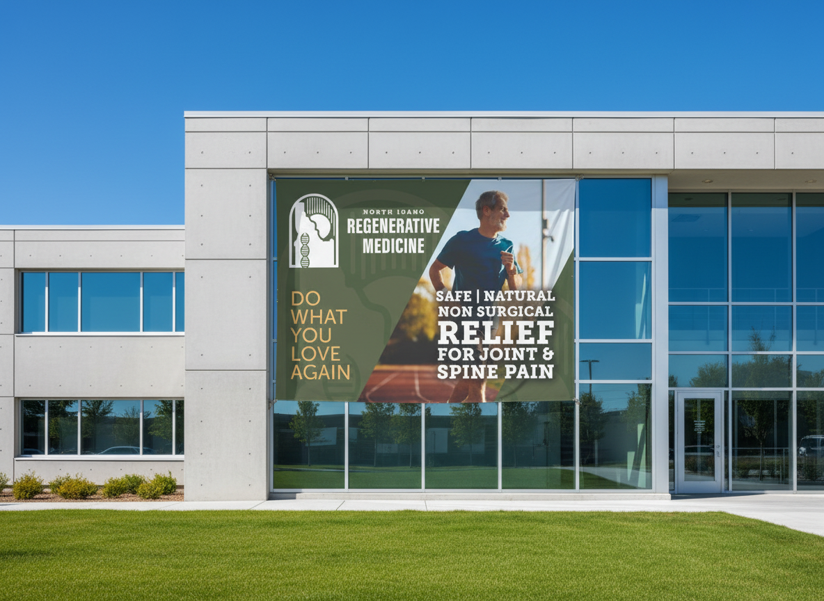
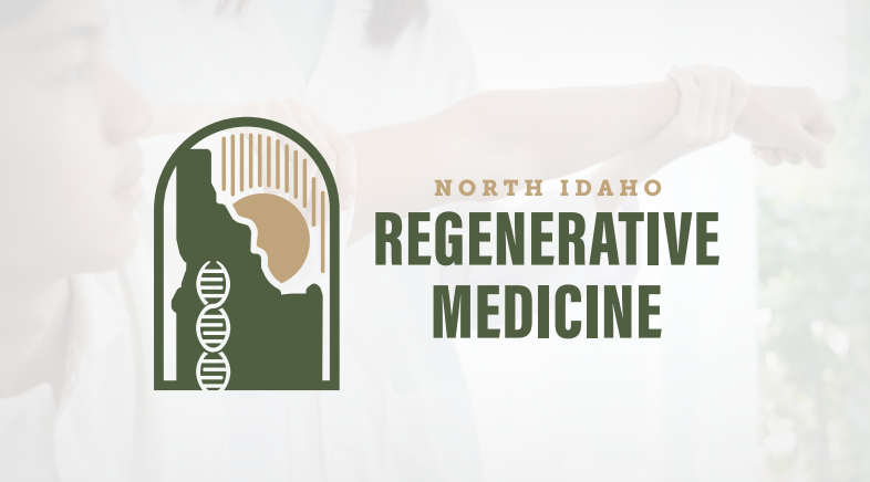
What a journey it's been with Aaron Potts on the "NIRM Custom Banner and Digital Display Design" project! We kicked things off in early February 2026, embarking on a creative mission to craft two eye-catching physical banners and a sleek digital TV slide display. Our goal was to ensure Aaron had high-resolution, print-ready files tailored specifically for vinyl with all the necessary grommets and pole pockets, alongside perfectly optimized digital assets for screen display. Our process began with a strategic design phase, setting the stage for what was to come. We then moved into a collaborative build and revision cycle, aiming for total alignment with Aaron's brand vision. Throughout this project, our team, including Alex Holder and Aaron Delarosa, worked diligently to bring Aaron Potts’s vision to life. Communication was key, and we made sure to keep Aaron in the loop every step of the way. On February 3rd, we sent over a form to gather all the essential information to kickstart the design process, ensuring we understood exactly what Aaron was looking for. Then, on February 11th, we were thrilled to share the first design build for review! Just two days later, on February 13th, we had the second build ready for Aaron's feedback. The pace picked up as we approached completion. By February 18th, we had the third build ready for review, and soon after, the final packaged files for both the TV banner and the print banners were ready for download! There was a small hiccup with an export issue, which we promptly addressed on February 18th, messaging Aaron right away to let him know we were on it. The very next day, February 19th, we confirmed that the files had been updated with the correct DPI quality for printing, and both the TV and print banners were available through the provided links. Finally, on February 20th ( Our founder Lawrence Magana's Birthday ) , we sent a follow-up to Aaron, offering assistance with any file format questions or further updates. This project saw both the Banner Design and Digital Banner Design tasks successfully completed, a testament to the teamwork and dedication of everyone involved. It's been a fantastic experience bringing Aaron's custom graphic design needs to fruition. We're proud to have delivered tailor-made, high-quality assets that truly reflect his brand. We're excited to see these banners and digital displays in action, making a real impact for Aaron Potts!
Enhance AI search accuracy with the llms.txt upgrade for PIXL websites. Request your upgrade today!
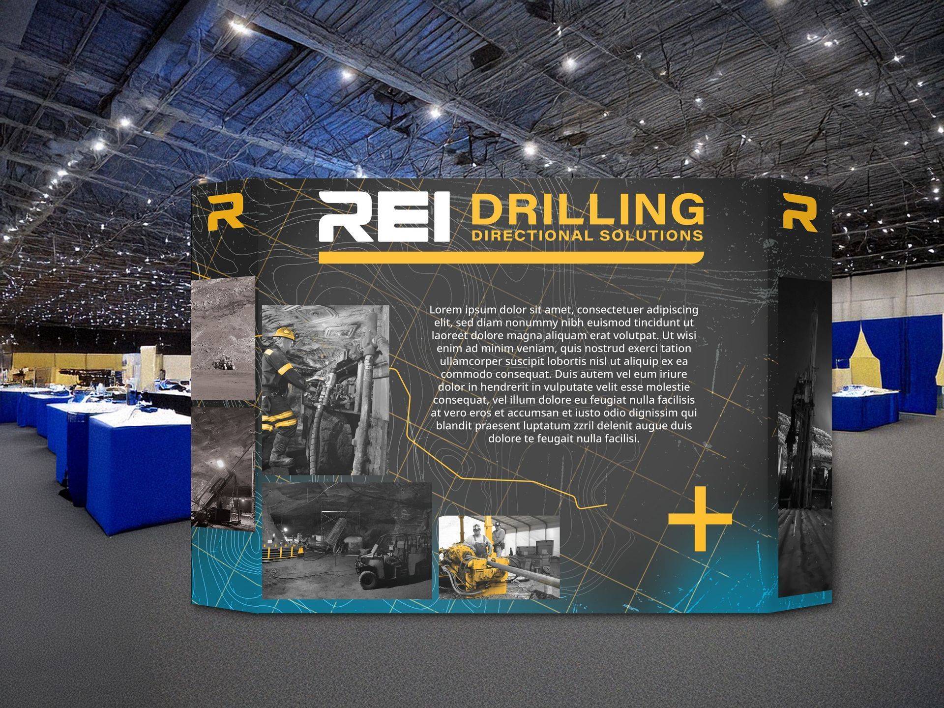
See how Dual Pixel redesigned REI Drilling's logo & website to enhance brand identity. Contact us for your design needs!
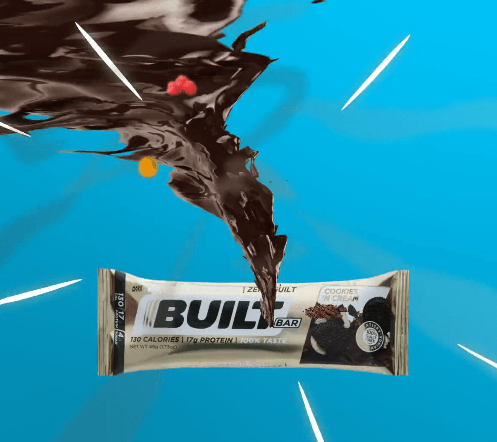
Dual Pixel teamed up with Built Bar to create an engaging motion graphics video that showcases the delicious flavors of their protein bars. The concept revolved around a dynamic tornado of vibrant ingredients—such as nuts, chocolate, and fruit—being swirled together and packed into a Built Bar. This creative approach aimed to visually highlight the product's appeal while capturing the attention of potential customers.
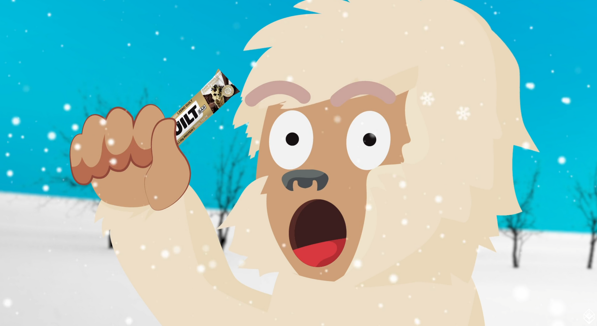
Dual Pixel's video team collaborated with Built Bar, a local Utah company renowned for its innovative protein bars. Our task was to create an engaging motion graphics animation that effectively communicates the unique selling point of Built Bar's products: the use of REAL Cookie Dough.
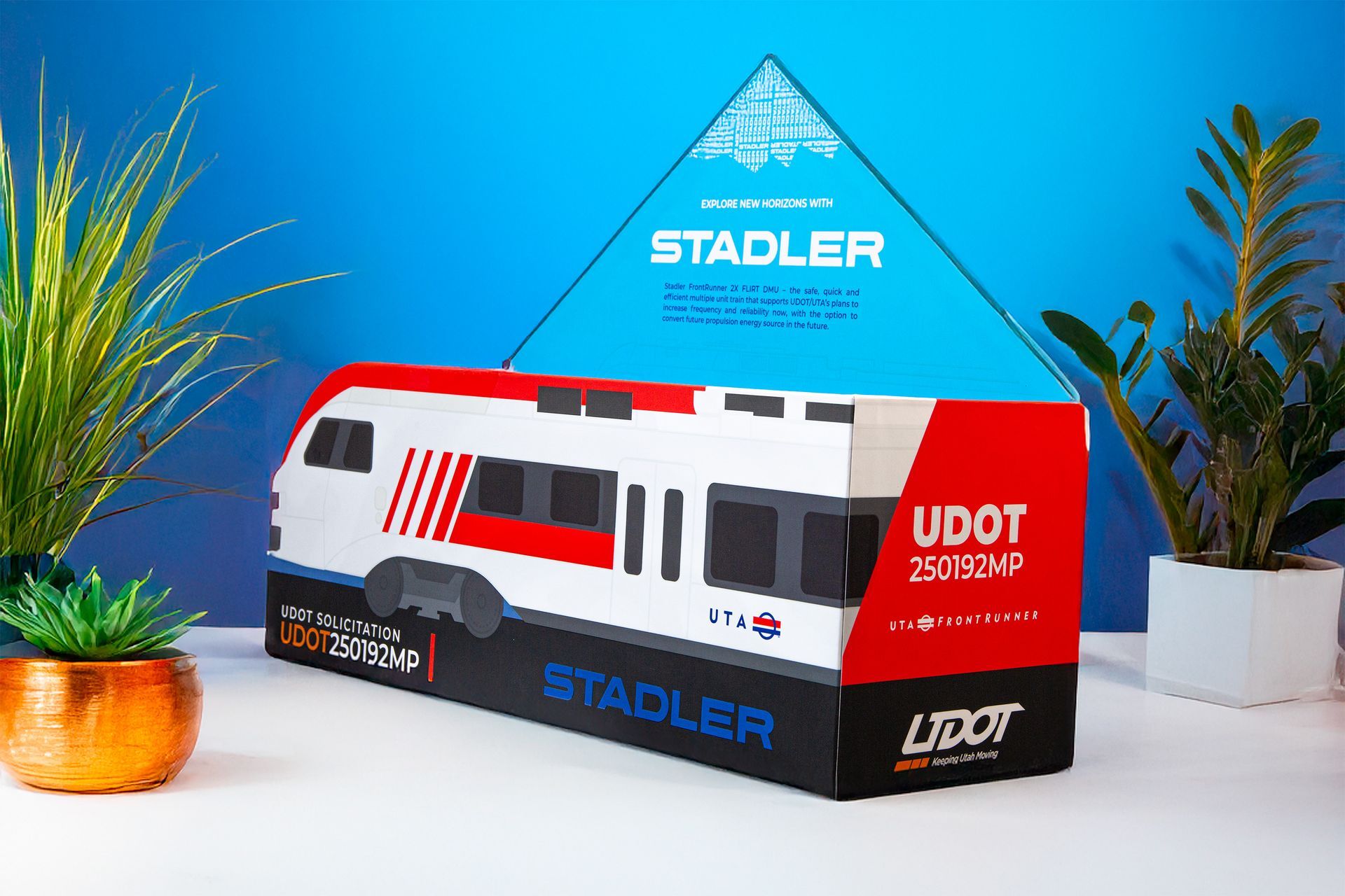
In a highly competitive bidding environment, the ability to present proposals effectively is crucial for success. Dual Pixel collaborated with STADLER to design a Premium Proposal Box specifically for the Utah Transit Authority's TRAX organization. This innovative solution allowed STADLER to showcase their proposal in a compelling manner, making it stand out among numerous submissions.
Learn how Dual Pixel created a nostalgic logo for BitJump Games, enhancing their brand identity. Contact us for your design needs!
Explore innovative brand design solutions by Dual Pixel Designs. Contact us to elevate your brand today!
Dual Pixel Designs LLC is an award-winning agency offering graphic design, web services, & marketing strategies. Contact us for innovative solutions!