
POINT OF SALE
BRANDING RE-DESIGN
BRANDING RE-DESIGN
Rebranding is one of the toughest marketing decisions a company can take. Even then, once the decision has been finalized, it is one of biggest corporate maneuvers a company can execute. That’s why, when our clients come to us asking for our help to rebrand them we step up to the digital plate and swing for the fences.
Challenge
Challenge
Rebranding is one of the toughest marketing decisions a company can take. Even then, once the decision has been finalized, it is one of biggest corporate manoeuvers a company can execute. That’s why, when our clients come to us asking for our help to rebrand them, we pull all the stops to deliver them a highly successful rebranding campaign. We put ourselves into the project, understand our client’s requirements, get a feel of what their customers think and want from them, and then create a rebranding strategy that works flawlessly.
POS Technologies realized this about us recently when they approached us to rebrand them. For me, as the head of team entrusted with the rebranding of POS Technologies, it was a massive challenge. Not because it was anything that we hadn’t already done, but because it was a well-established brand in the market. So, it would be an understatement to say that it was a challenging responsibility.


Our Solution
Our Solution
At Dual Pixel, our first step is to understand where the brand stands at present. We sat with the executives from POS Technologies, and discussed in detail the products they offer, their pricing strategies, their positioning, their marketing strategies, and even their sales. We began to gain an understanding of how their business works.
As we poured over their marketing history, we began to notice a pattern of sorts. They were a tech company, working in a highly competitive B2B segment, and their primary branding color was red. That’s a huge ‘red’ flag in my book.
For starters, the color red works best in industries where the customers make impulsive purchase decisions, such as the fast food industry. Red color is known to increase blood pressure, and create a sense of urgency in people. That’s why fast food chains use it. For a B2B tech company, where the purchase decisions are made after weeks, if not months, of planning and discussions, red is simply not the color to go for. Plus, red is a symbol of termination or suspension. So, it was certainly not resonating with the customers, considering that they are in the tech business.
POS Technologies needed a complete overhaul of its brand image and now we finally knew what we should transform it into. It needed to be the exact opposite of what it was. Here’s what my team did with the brand:
ALWAYS READY
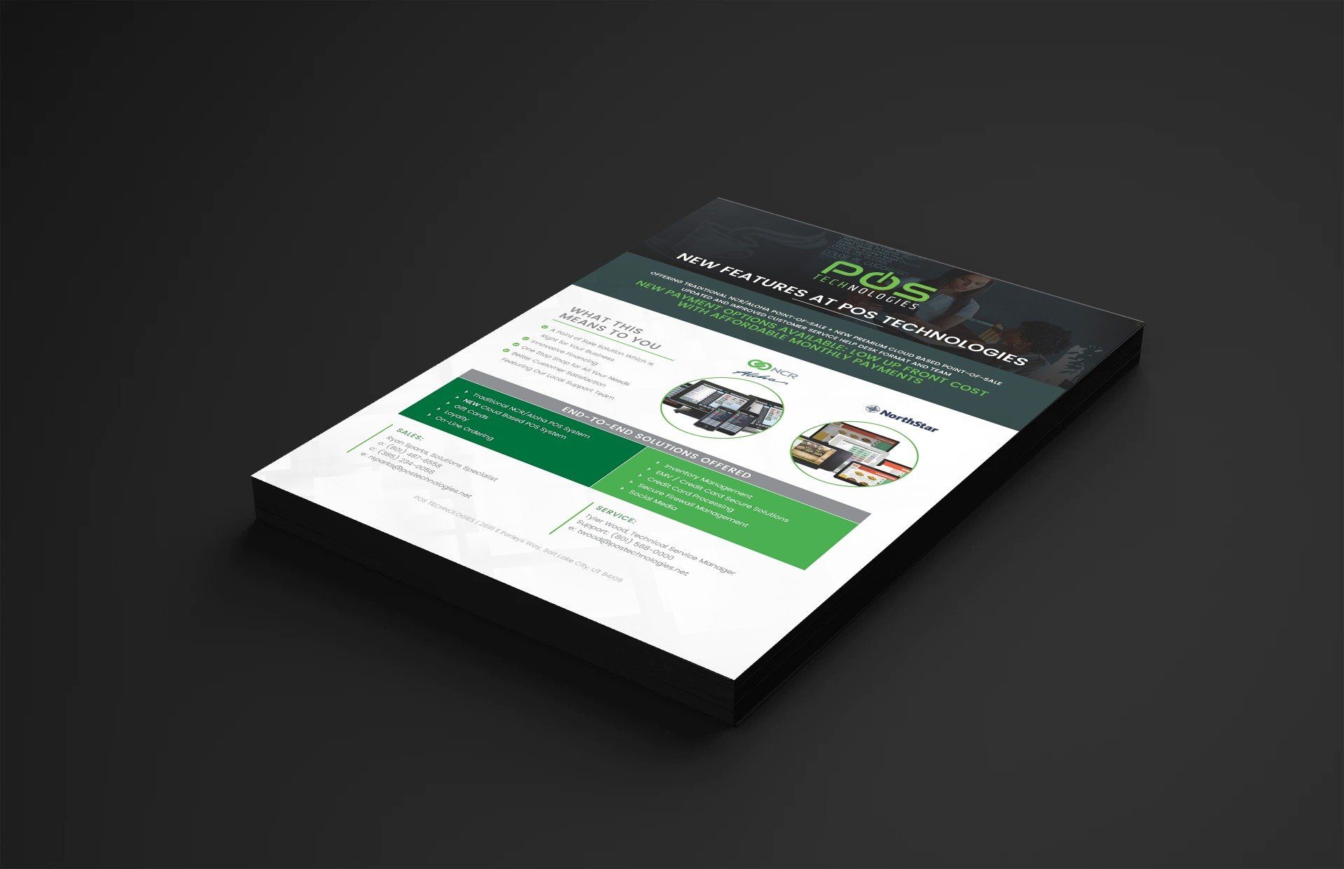
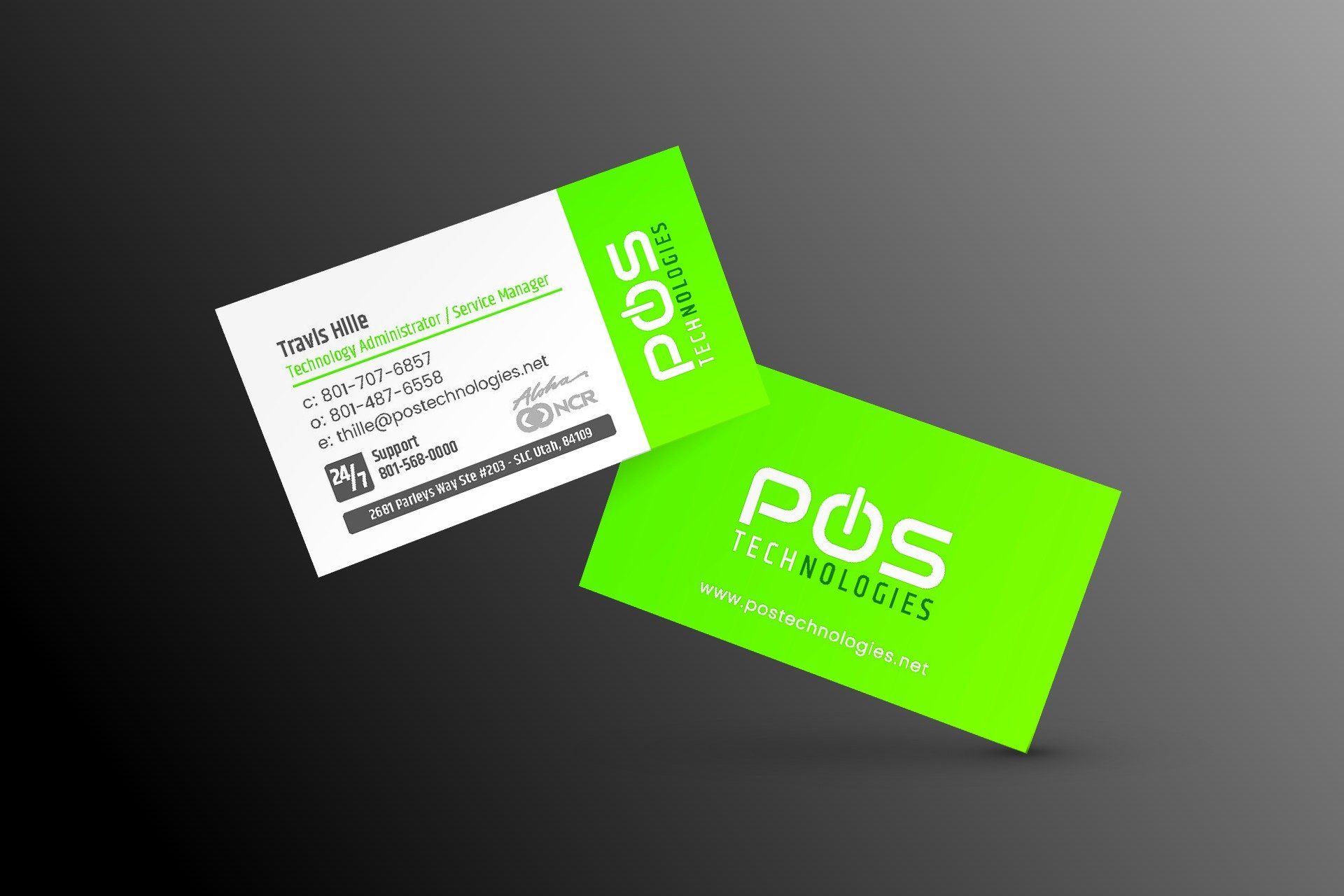
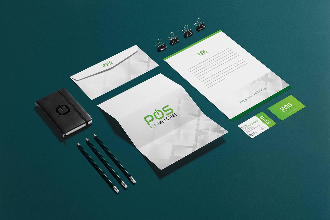
A complete re-imagination of colors from the ground up. Everything old had to go – the colors, the fonts, the designs – everything. We came up with a whole new set of branding colors, fonts, logos, website colors, and other marketing material.
REBUILT FROM THE INSIDE OUT
Getting rid of the red color wasn’t enough. We had to make a point that we convey a message that POS Technologies is always there for its clients 24/7. We achieved it with the Power symbol in the logo. Now, POS’s logo, with its Power symbol and green color, beckons its customers as a company that is always ready to serve them.
POWER UP
Our choice of shades, contrast, and color schemes were such that the colors feel liquid. This gives a modern feel to the business.